
Why Most Business Websites Don't Convert Visitors into Customers
Why Most Business Websites Don't Convert Visitors into Customers

Keziah Chinnu
Keziah Chinnu
Co-Founder, Kayora Design Company
Co-Founder, Kayora Design Company
5 min read
5 min read
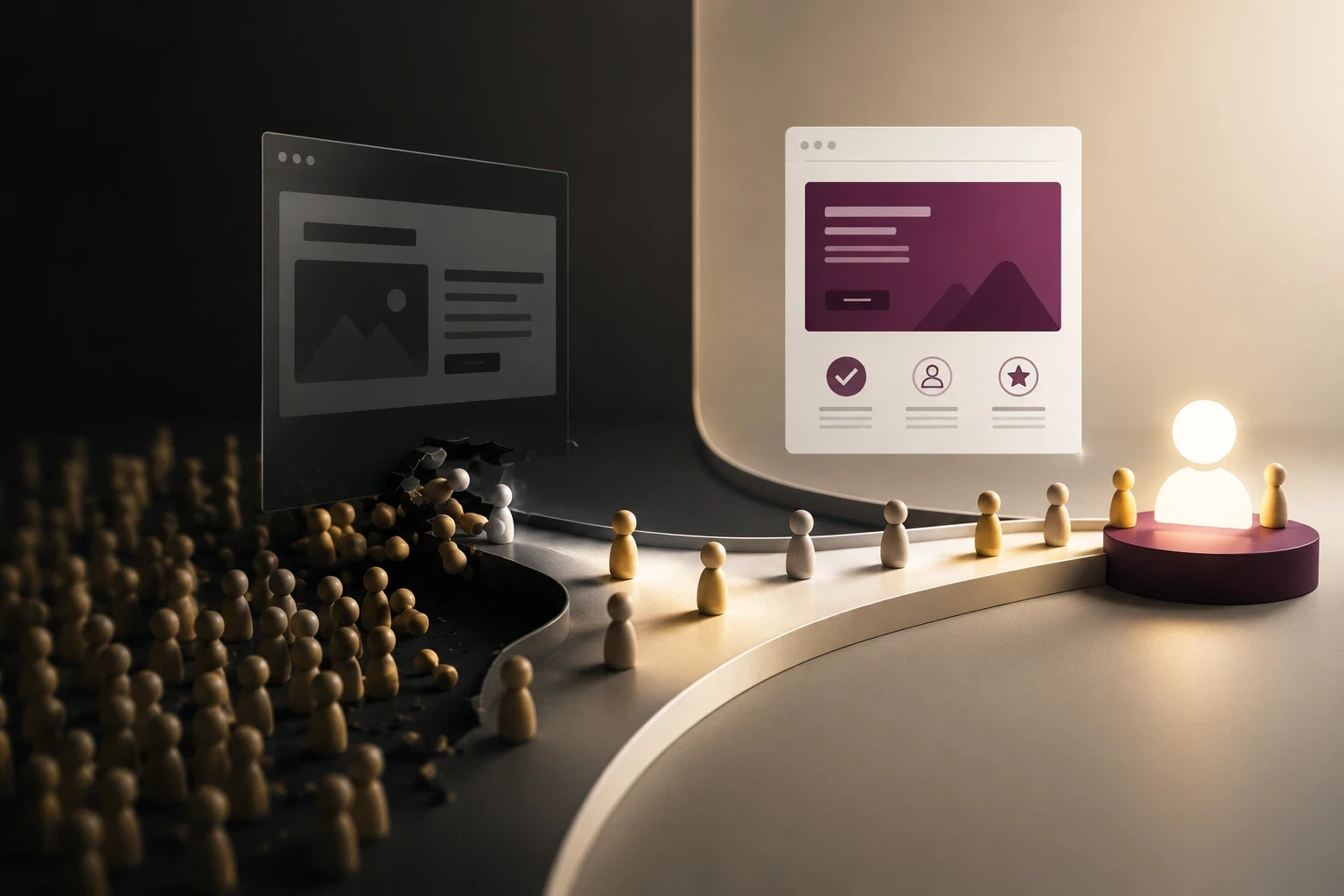
Your website should be your hardest-working salesperson.
It works around the clock, reaches people before you ever speak to them, and often determines whether a potential customer trusts your business enough to make contact. Yet many businesses spend thousands on a new website only to discover that visitors leave without making an enquiry, requesting a quote, or completing a purchase.
This is something we see often working with businesses across Abu Dhabi and the wider UAE. A website that attracts 5,000 visitors but generates only a handful of enquiries isn't delivering business value. On the other hand, a well-designed website with fewer visitors can consistently generate qualified leads because it guides users toward taking action.
Website performance is directly tied to business outcomes. According to Google, 53% of mobile users abandon a website that takes longer than three seconds to load. If your website is slow or frustrating to use, you're likely losing potential customers before they even see what your business has to offer.
The good news is that most conversion problems aren't caused by a single major flaw. They're usually the result of several small usability issues that collectively create friction throughout the customer journey.
In this guide, we'll explore the most common reasons business websites fail to convert, explain how user experience influences purchasing decisions, and share practical ways to transform your website into a more effective business tool.
What Does Website Conversion Really Mean?
A website conversion is any meaningful action a visitor takes that moves them closer to
becoming a customer.
Depending on your business, this could include:
Requesting a quotation
Booking a consultation
Purchasing a product
Filling out a contact form
Calling your business
Downloading a brochure
Subscribing to a newsletter
Many businesses mistakenly focus only on increasing website traffic. While attracting visitors is
important, traffic alone doesn't generate revenue. A successful website is one that encourages
visitors to take the next step.
Think of your website as a guided conversation. Every page should answer questions, build
confidence, and make the next action feel obvious.
Why Visitors Leave Without Taking Action
Imagine walking into a beautifully designed showroom where nobody greets you, product
information is difficult to find, signs point in different directions, and the checkout counter is
hidden at the back.
You'd probably leave.
The same thing happens online.
Within seconds of landing on your website, visitors begin asking themselves several questions:
Am I in the right place?
Can I trust this business?
Do they understand my problem?
Can I easily find what I'm looking for?
What should I do next?
If your website fails to answer those questions quickly, users are unlikely to stay long enough to
become customers.
Successful websites remove uncertainty. They make every step feel effortless.
The 10 Most Common Reasons Business Websites Fail to Convert
Your Value Proposition Isn't Clear
Visitors shouldn't have to guess what your business does.
One of the biggest mistakes companies make is filling their homepage with vague marketing
language instead of clearly communicating the value they provide.
Compare these two headlines:Generic
We provide innovative digital solutions.
Now compare it with:Specific
We help businesses build premium brands and high-performing websites that
generate more enquiries.
The second immediately tells visitors who the business serves, what it offers, and the outcome
they can expect.
A strong value proposition should answer three simple questions:
Who do you help?
What problem do you solve?
Why should someone choose you instead of a competitor?
If visitors can't answer those questions within a few seconds, they're likely to leave.
Your Website Priorities Looks Over Usability
A visually impressive website can capture attention, but appearance alone doesn't generate
conversions.
Many businesses become so focused on creating something unique that they overlook the
fundamentals of usability.
Common problems include:
● Overly complex layouts
● Difficult navigation
● Small or hidden buttons
● Poor readability
● Excessive animations
● Inconsistent page structure
Good design isn't about making people stop and admire the interface. It's about helping them
achieve their goals with as little effort as possible.
Before adding another animation or visual effect, ask yourself:
Does this help users make a decision, or does it simply look interesting?
If it doesn't improve the user experience, it probably isn't improving conversions either.Slow Loading Speeds Drive Visitors Away
Even the best-designed website won't convert visitors if they never wait for it to load.
Research from Google found that 53% of mobile users abandon a page that takes longer
than three seconds to load. In a competitive market, that's a significant number of potential
customers lost before they even engage with your content.
Slow websites also affect search engine rankings, meaning performance impacts both visibility
and conversions.
Some of the most common causes of poor website performance include:
● Large, uncompressed images
● Poor hosting providers
● Excessive JavaScript
● Too many third-party plugins
● Unnecessary animations
Improving page speed isn't just a technical exercise—it's one of the simplest ways to reduce
friction and improve the overall user experience.The Mobile Experience Is Treated as an Afterthought
Today's customers expect every website to work seamlessly on their phones.
According to Statcounter Global Stats, mobile devices now account for well over half of
global web traffic. For many industries, mobile visitors actually outnumber desktop users.
Yet it's still common to find websites where:
● Text is too small to read
● Buttons are difficult to tap
● Navigation feels cramped
● Images load slowly
● Forms are frustrating to complete
A responsive website isn't enough anymore. Businesses should adopt a mobile-first design approach, where the experience is designed for smaller screens first and then expanded for larger devices. This ensures that every visitor, regardless of device, enjoys a smooth and intuitive experience. When users can browse, read, and contact your business without friction, they're far more likely to convert.Your Website Doesn't Build Trust
People rarely buy from businesses they don't trust.
Trust isn't built through one impressive headline or a polished logo. It's built through dozens of
small signals that reassure visitors they're dealing with a credible business.
In a well-known study by the Stanford Web Credibility Project, 75% of users said they judge
a company's credibility based on its website design. That means design quality influences
trust long before a sales conversation begins.
High-converting websites consistently include trust-building elements such as:
● Genuine client testimonials
● Detailed case studies
● Google reviews
● Industry certifications
● Awards and recognitions
● Professional team photography
● Clear contact information
● Transparent processes
Imagine comparing two agencies.
One uses generic stock photos, provides no evidence of past work, and offers little information
about its team. The other showcases real client projects, explains its design process, and features authentic testimonials from satisfied customers. Most people won't need long to decide which business feels more trustworthy.Your Calls-to-Action Don't Encourage Action
Imagine reading an entire service page, becoming interested in what a company offers, and
then reaching the end with a tiny "Submit" button.It happens more often than you'd think.
A call-to-action (CTA) should clearly tell visitors what happens next and why it's worth taking
that step. Generic labels like "Learn More" or "Click Here" create uncertainty and rarely
inspire action.
Instead, focus on outcomes.
Good CTA examples include:
● Book a Free Discovery Call
● Request a Custom Quote
● Let's Discuss Your Project
● Start Your Website Redesign
Equally important is where your CTAs appear. Visitors shouldn't have to scroll to the bottom of
a page to find the next step. Place them naturally throughout the page, especially after
explaining a key benefit or solving a common objection.Too Much Information Creates Decision Fatigue
When businesses know their products or services inside out, it's tempting to explain everything
at once. Unfortunately, visitors don't read websites the way business owners write them.
Most users scan. They look for headings, keywords, visuals, and short sections that quickly
answer their questions. Large walls of text, lengthy paragraphs, and cluttered layouts increase cognitive load, making it harder for users to decide what to do next. Instead:
● Use descriptive headings.
● Break content into shorter paragraphs.
● Highlight key information with bullet points.
● Include relevant visuals where appropriate.
● Focus on one idea per section.
A clear, structured page helps visitors absorb information without feeling overwhelmed.Your Navigation Makes People Think Too Much
Navigation should feel invisible.
When visitors have to stop and figure out where to click, you've already introduced friction into
the experience.
A simple navigation menu is almost always more effective than one overloaded with pages.
For most businesses, the essentials are enough:
● Home
● Services
● About
● Portfolio or Work
● Blog
● Contact
Every additional menu item asks users to make another decision. According to Hick's Law, the
more choices people have, the longer it takes them to decide. The goal isn't to show everything your business does. It's to guide visitors towards the information they need most.You're Ignoring UX Psychology
High-converting websites aren't built on guesswork. They're designed around how people
naturally think and behave.
Understanding a few core UX principles can make a noticeable difference.
Visual Hierarchy
People don't read webpages from top to bottom. Their attention is naturally drawn to larger
headings, contrasting buttons, and prominent visuals.
Your most important message should always be the easiest thing to notice.Social Proof
When visitors see testimonials, reviews, or recognisable client logos, uncertainty decreases.
People feel more confident choosing a business that others have already trusted.
Progressive Disclosure
Rather than presenting every piece of information at once, reveal content gradually as visitors
move through the page.
This keeps the experience focused and prevents information overload.
Consistency
Buttons, colours, typography, spacing, and layouts should remain consistent across every page.
Consistency reduces cognitive effort and creates a more professional, trustworthy experience.
Good UX isn't about following trends—it's about removing unnecessary friction.You Launch Your Website and Never Improve It
One of the biggest misconceptions about websites is that they're "finished" once they go live.
In reality, the best-performing websites are continuously refined.
Instead of relying on assumptions, successful businesses monitor how real users interact with
their websites.
Some useful metrics include:
● Bounce rate
● Average session duration
● Conversion rate
● Form completion rate
● CTA click-through rate
● Scroll depth
● Heatmaps
● User recordingsSmall improvements—such as changing a headline, simplifying a form, or improving page
speed—can often produce meaningful increases in enquiries over time.
The most successful websites evolve alongside the businesses they represent.
What High-Converting Websites Do Differently
Low-Converting Website | High-Converting Website |
|---|---|
Slow loading pages | Fast, optimised performance |
Weak branding | Consistent visual identity |
Cluttered layouts | Clear visual hierarchy |
Poor mobile experience | Mobile-first design |
Hidden CTAs | Clear, action-focused CTAs |
No social proof | Reviews, testimonials and case studies |
Difficult navigation | Simple, intuitive user journeys |
Built once and forgotten | Continuously tested and improved |
Accessibility Isn't Optional
Accessibility is often viewed as a compliance requirement, but it's really about creating better
experiences for everyone.
According to the World Health Organization, around 16% of the world's population lives
with a significant disability. An accessible website allows more people to interact with your
business while improving usability for every visitor.
Simple improvements include:
● Sufficient colour contrast
● Readable font sizes
● Descriptive image alt text
● Keyboard-friendly navigation
● Clearly labelled forms
● Logical heading hierarchy
These improvements not only support accessibility but also enhance SEO, usability, and overall
user satisfaction.
Great UX Is a Business Investment, Not a Cost
Many businesses hesitate to invest in user experience because they see it as an aesthetic
upgrade. In reality, UX is closely tied to business performance.
Research by Forrester, widely cited by IBM, estimates that every $1 invested in UX can
deliver up to $100 in return through increased conversions, higher customer satisfaction, and
reduced development costs. Of course, every business is different, and actual returns vary. However, the principle remains the same: improving user experience reduces friction, making it easier for visitors to become
customers.
A website shouldn't simply look professional. It should actively support your business goals.
-> Expert Tip
When reviewing your website, don't ask "Does it look modern?"
Ask "Can a first-time visitor understand what we do, trust us, and take the
next step within a few minutes?"
If the answer is no, improving your user experience will likely have a greater impact
than another visual redesign.
Website Conversion Checklist
Before launching or redesigning your website, ask yourself:
● Is our value proposition clear within the first few seconds?
● Does every page have one primary call-to-action?
● Does the website load quickly?
● Is the experience excellent on mobile devices?
● Are testimonials and trust signals visible?
● Is navigation simple and intuitive?
● Is the content easy to scan?
● Have we considered accessibility?
● Are analytics installed to measure performance?
● Have we tested the website with real users?
If you answered "No" to several of these questions, there's a good chance your website has
opportunities to improve its conversion rate.
Final Thoughts
Many businesses see their website as a digital brochure—a place to showcase services and company information. The highest-performing businesses see it differently. They treat their website as a strategic business asset that educates visitors, builds trust, answers objections, and guides people toward taking action. A high-converting website isn't necessarily the one with the most animations, the boldest
visuals, or the latest design trends. It's the one that makes every interaction feel clear, intuitive,
and purposeful. By investing in thoughtful branding, user-centred design, strong messaging, and continuous optimisation, businesses create websites that don't just attract visitors—they convert them into long-term customers.
Ready to Build a Website That Converts?
At Kayora Design Company, a web design company based in Abu Dhabi, we believe great design should deliver measurable business results, not just look impressive.
Whether you're launching a new business, refreshing your brand, or redesigning an existing
website, we combine strategy, branding, UI/UX design, and modern web development to
create digital experiences that are built around your customers and your goals.
If your current website isn't generating the enquiries or sales you expected, it may not need
more traffic—it may simply need a better user experience.
Let's build a website that works as hard as you do.
Your website should be your hardest-working salesperson.
It works around the clock, reaches people before you ever speak to them, and often determines whether a potential customer trusts your business enough to make contact. Yet many businesses spend thousands on a new website only to discover that visitors leave without making an enquiry, requesting a quote, or completing a purchase.
This is something we see often working with businesses across Abu Dhabi and the wider UAE. A website that attracts 5,000 visitors but generates only a handful of enquiries isn't delivering business value. On the other hand, a well-designed website with fewer visitors can consistently generate qualified leads because it guides users toward taking action.
Website performance is directly tied to business outcomes. According to Google, 53% of mobile users abandon a website that takes longer than three seconds to load. If your website is slow or frustrating to use, you're likely losing potential customers before they even see what your business has to offer.
The good news is that most conversion problems aren't caused by a single major flaw. They're usually the result of several small usability issues that collectively create friction throughout the customer journey.
In this guide, we'll explore the most common reasons business websites fail to convert, explain how user experience influences purchasing decisions, and share practical ways to transform your website into a more effective business tool.
What Does Website Conversion Really Mean?
A website conversion is any meaningful action a visitor takes that moves them closer to
becoming a customer.
Depending on your business, this could include:
Requesting a quotation
Booking a consultation
Purchasing a product
Filling out a contact form
Calling your business
Downloading a brochure
Subscribing to a newsletter
Many businesses mistakenly focus only on increasing website traffic. While attracting visitors is
important, traffic alone doesn't generate revenue. A successful website is one that encourages
visitors to take the next step.
Think of your website as a guided conversation. Every page should answer questions, build
confidence, and make the next action feel obvious.
Why Visitors Leave Without Taking Action
Imagine walking into a beautifully designed showroom where nobody greets you, product
information is difficult to find, signs point in different directions, and the checkout counter is
hidden at the back.
You'd probably leave.
The same thing happens online.
Within seconds of landing on your website, visitors begin asking themselves several questions:
Am I in the right place?
Can I trust this business?
Do they understand my problem?
Can I easily find what I'm looking for?
What should I do next?
If your website fails to answer those questions quickly, users are unlikely to stay long enough to
become customers.
Successful websites remove uncertainty. They make every step feel effortless.
The 10 Most Common Reasons Business Websites Fail to Convert
Your Value Proposition Isn't Clear
Visitors shouldn't have to guess what your business does.
One of the biggest mistakes companies make is filling their homepage with vague marketing
language instead of clearly communicating the value they provide.
Compare these two headlines:Generic
We provide innovative digital solutions.
Now compare it with:Specific
We help businesses build premium brands and high-performing websites that
generate more enquiries.
The second immediately tells visitors who the business serves, what it offers, and the outcome
they can expect.
A strong value proposition should answer three simple questions:
Who do you help?
What problem do you solve?
Why should someone choose you instead of a competitor?
If visitors can't answer those questions within a few seconds, they're likely to leave.
Your Website Priorities Looks Over Usability
A visually impressive website can capture attention, but appearance alone doesn't generate
conversions.
Many businesses become so focused on creating something unique that they overlook the
fundamentals of usability.
Common problems include:
● Overly complex layouts
● Difficult navigation
● Small or hidden buttons
● Poor readability
● Excessive animations
● Inconsistent page structure
Good design isn't about making people stop and admire the interface. It's about helping them
achieve their goals with as little effort as possible.
Before adding another animation or visual effect, ask yourself:
Does this help users make a decision, or does it simply look interesting?
If it doesn't improve the user experience, it probably isn't improving conversions either.Slow Loading Speeds Drive Visitors Away
Even the best-designed website won't convert visitors if they never wait for it to load.
Research from Google found that 53% of mobile users abandon a page that takes longer
than three seconds to load. In a competitive market, that's a significant number of potential
customers lost before they even engage with your content.
Slow websites also affect search engine rankings, meaning performance impacts both visibility
and conversions.
Some of the most common causes of poor website performance include:
● Large, uncompressed images
● Poor hosting providers
● Excessive JavaScript
● Too many third-party plugins
● Unnecessary animations
Improving page speed isn't just a technical exercise—it's one of the simplest ways to reduce
friction and improve the overall user experience.The Mobile Experience Is Treated as an Afterthought
Today's customers expect every website to work seamlessly on their phones.
According to Statcounter Global Stats, mobile devices now account for well over half of
global web traffic. For many industries, mobile visitors actually outnumber desktop users.
Yet it's still common to find websites where:
● Text is too small to read
● Buttons are difficult to tap
● Navigation feels cramped
● Images load slowly
● Forms are frustrating to complete
A responsive website isn't enough anymore. Businesses should adopt a mobile-first design approach, where the experience is designed for smaller screens first and then expanded for larger devices. This ensures that every visitor, regardless of device, enjoys a smooth and intuitive experience. When users can browse, read, and contact your business without friction, they're far more likely to convert.Your Website Doesn't Build Trust
People rarely buy from businesses they don't trust.
Trust isn't built through one impressive headline or a polished logo. It's built through dozens of
small signals that reassure visitors they're dealing with a credible business.
In a well-known study by the Stanford Web Credibility Project, 75% of users said they judge
a company's credibility based on its website design. That means design quality influences
trust long before a sales conversation begins.
High-converting websites consistently include trust-building elements such as:
● Genuine client testimonials
● Detailed case studies
● Google reviews
● Industry certifications
● Awards and recognitions
● Professional team photography
● Clear contact information
● Transparent processes
Imagine comparing two agencies.
One uses generic stock photos, provides no evidence of past work, and offers little information
about its team. The other showcases real client projects, explains its design process, and features authentic testimonials from satisfied customers. Most people won't need long to decide which business feels more trustworthy.Your Calls-to-Action Don't Encourage Action
Imagine reading an entire service page, becoming interested in what a company offers, and
then reaching the end with a tiny "Submit" button.It happens more often than you'd think.
A call-to-action (CTA) should clearly tell visitors what happens next and why it's worth taking
that step. Generic labels like "Learn More" or "Click Here" create uncertainty and rarely
inspire action.
Instead, focus on outcomes.
Good CTA examples include:
● Book a Free Discovery Call
● Request a Custom Quote
● Let's Discuss Your Project
● Start Your Website Redesign
Equally important is where your CTAs appear. Visitors shouldn't have to scroll to the bottom of
a page to find the next step. Place them naturally throughout the page, especially after
explaining a key benefit or solving a common objection.Too Much Information Creates Decision Fatigue
When businesses know their products or services inside out, it's tempting to explain everything
at once. Unfortunately, visitors don't read websites the way business owners write them.
Most users scan. They look for headings, keywords, visuals, and short sections that quickly
answer their questions. Large walls of text, lengthy paragraphs, and cluttered layouts increase cognitive load, making it harder for users to decide what to do next. Instead:
● Use descriptive headings.
● Break content into shorter paragraphs.
● Highlight key information with bullet points.
● Include relevant visuals where appropriate.
● Focus on one idea per section.
A clear, structured page helps visitors absorb information without feeling overwhelmed.Your Navigation Makes People Think Too Much
Navigation should feel invisible.
When visitors have to stop and figure out where to click, you've already introduced friction into
the experience.
A simple navigation menu is almost always more effective than one overloaded with pages.
For most businesses, the essentials are enough:
● Home
● Services
● About
● Portfolio or Work
● Blog
● Contact
Every additional menu item asks users to make another decision. According to Hick's Law, the
more choices people have, the longer it takes them to decide. The goal isn't to show everything your business does. It's to guide visitors towards the information they need most.You're Ignoring UX Psychology
High-converting websites aren't built on guesswork. They're designed around how people
naturally think and behave.
Understanding a few core UX principles can make a noticeable difference.
Visual Hierarchy
People don't read webpages from top to bottom. Their attention is naturally drawn to larger
headings, contrasting buttons, and prominent visuals.
Your most important message should always be the easiest thing to notice.Social Proof
When visitors see testimonials, reviews, or recognisable client logos, uncertainty decreases.
People feel more confident choosing a business that others have already trusted.
Progressive Disclosure
Rather than presenting every piece of information at once, reveal content gradually as visitors
move through the page.
This keeps the experience focused and prevents information overload.
Consistency
Buttons, colours, typography, spacing, and layouts should remain consistent across every page.
Consistency reduces cognitive effort and creates a more professional, trustworthy experience.
Good UX isn't about following trends—it's about removing unnecessary friction.You Launch Your Website and Never Improve It
One of the biggest misconceptions about websites is that they're "finished" once they go live.
In reality, the best-performing websites are continuously refined.
Instead of relying on assumptions, successful businesses monitor how real users interact with
their websites.
Some useful metrics include:
● Bounce rate
● Average session duration
● Conversion rate
● Form completion rate
● CTA click-through rate
● Scroll depth
● Heatmaps
● User recordingsSmall improvements—such as changing a headline, simplifying a form, or improving page
speed—can often produce meaningful increases in enquiries over time.
The most successful websites evolve alongside the businesses they represent.
What High-Converting Websites Do Differently
Low-Converting Website | High-Converting Website |
|---|---|
Slow loading pages | Fast, optimised performance |
Weak branding | Consistent visual identity |
Cluttered layouts | Clear visual hierarchy |
Poor mobile experience | Mobile-first design |
Hidden CTAs | Clear, action-focused CTAs |
No social proof | Reviews, testimonials and case studies |
Difficult navigation | Simple, intuitive user journeys |
Built once and forgotten | Continuously tested and improved |
Accessibility Isn't Optional
Accessibility is often viewed as a compliance requirement, but it's really about creating better
experiences for everyone.
According to the World Health Organization, around 16% of the world's population lives
with a significant disability. An accessible website allows more people to interact with your
business while improving usability for every visitor.
Simple improvements include:
● Sufficient colour contrast
● Readable font sizes
● Descriptive image alt text
● Keyboard-friendly navigation
● Clearly labelled forms
● Logical heading hierarchy
These improvements not only support accessibility but also enhance SEO, usability, and overall
user satisfaction.
Great UX Is a Business Investment, Not a Cost
Many businesses hesitate to invest in user experience because they see it as an aesthetic
upgrade. In reality, UX is closely tied to business performance.
Research by Forrester, widely cited by IBM, estimates that every $1 invested in UX can
deliver up to $100 in return through increased conversions, higher customer satisfaction, and
reduced development costs. Of course, every business is different, and actual returns vary. However, the principle remains the same: improving user experience reduces friction, making it easier for visitors to become
customers.
A website shouldn't simply look professional. It should actively support your business goals.
-> Expert Tip
When reviewing your website, don't ask "Does it look modern?"
Ask "Can a first-time visitor understand what we do, trust us, and take the
next step within a few minutes?"
If the answer is no, improving your user experience will likely have a greater impact
than another visual redesign.
Website Conversion Checklist
Before launching or redesigning your website, ask yourself:
● Is our value proposition clear within the first few seconds?
● Does every page have one primary call-to-action?
● Does the website load quickly?
● Is the experience excellent on mobile devices?
● Are testimonials and trust signals visible?
● Is navigation simple and intuitive?
● Is the content easy to scan?
● Have we considered accessibility?
● Are analytics installed to measure performance?
● Have we tested the website with real users?
If you answered "No" to several of these questions, there's a good chance your website has
opportunities to improve its conversion rate.
Final Thoughts
Many businesses see their website as a digital brochure—a place to showcase services and company information. The highest-performing businesses see it differently. They treat their website as a strategic business asset that educates visitors, builds trust, answers objections, and guides people toward taking action. A high-converting website isn't necessarily the one with the most animations, the boldest
visuals, or the latest design trends. It's the one that makes every interaction feel clear, intuitive,
and purposeful. By investing in thoughtful branding, user-centred design, strong messaging, and continuous optimisation, businesses create websites that don't just attract visitors—they convert them into long-term customers.
Ready to Build a Website That Converts?
At Kayora Design Company, a web design company based in Abu Dhabi, we believe great design should deliver measurable business results, not just look impressive.
Whether you're launching a new business, refreshing your brand, or redesigning an existing
website, we combine strategy, branding, UI/UX design, and modern web development to
create digital experiences that are built around your customers and your goals.
If your current website isn't generating the enquiries or sales you expected, it may not need
more traffic—it may simply need a better user experience.
Let's build a website that works as hard as you do.
Have a project in mind?
Have a project in mind?
From branding to full websites, we handle it from first sketch to launch.
From branding to full websites, we handle it from first sketch to launch.
More Blogs
5 min read
5 min read
How Much Does Branding Cost in Abu Dhabi? What Businesses Should Expect
How Much Does Branding Cost in Abu Dhabi? What Businesses Should Expect
5 min read
5 min read
5 Signs Your Business Needs a Website Redesign
5 Signs Your Business Needs a Website Redesign

4 min read
4 min read
Website Design Company in Abu Dhabi: 8 Things to Look for Before You Hire
Website Design Company in Abu Dhabi: 8 Things to Look for Before You Hire
Services
Contact
kayoradesign@gmail.com
Cubes Park, B-5, Musaffah, M25 Abu Dhabi, United Arab Emirates
Services
Contact
kayoradesign@gmail.com
Cubes Park, B-5, Musaffah, M25 Abu Dhabi, United Arab Emirates